
Challenge
Municipalities were drowning in a sea of applications, and let’s just say things weren’t running as smoothly as anyone hoped. Delays piled up, inefficiencies popped up everywhere, and residents - especially those who needed help the most - found themselves struggling with the system. It quickly became obvious: something had to change. A faster, simpler, and more resident-friendly solution was needed.
Solution
Bring this SaaS solution to market wasn’t just about launching a product - it was about buiding a brand that truly connects. With a name that sticks, a voice that resonates, and a personality that shines, Creanza crafted a clear, compelling identity and materials that speaks to a diverse audience.
Results
Keesy represents a fresh approach to support services - one that’s intuitive, accessible, and built for today’s world. It’s more than just a name; it’s a promise of a smoother, smarter way to navigate the system, ensuring help reaches those who need it without unnecessary hassle. Keesy isn’t just about technology; it’s about making assistance feel effortless, bridging the gap between municipalities and residents.
Keesy
Revolutionizing Municipal Assistance

Case study
Over the past few years, OIS spotted a big opportunity to shake things up in the world of municipal services. The application process for "livelihood and special assistance" was, well... let's just say it wasn’t winning any awards for speed or simplicity. It left municipalities bogged down and residents feeling frustrated.
Enter OIS’s automated solution - the ultimate upgrade designed to cut the clutter, save time, and make life easier for everyone. Think of it as giving the whole system a much-needed makeover for smoother, faster service delivery.
OIS rolled out an automated solution designed to make the application process faster and easier for everyone involved - no more headaches or endless waiting! They kicked things off with some pilot programs, which showed the concept really worked. With those wins under their belt, they reached out to Creanza and get the experts involved. It was time for branding the solutions and bringing them to market.
Keesy
Revolutionizing Municipal Assistance
Bringing this SaaS solution to market wasn’t just about launching a product – it was about creating a brand that truly connects.
That meant starting with the essentials: a name that sticks, a voice that resonates, and a personality that shines across every touchpoint. Since the audience was diverse, we had to craft materials that spoke their language while keeping things clear, compelling, and usable.
The goal? A brand that not only stands out but also makes navigating municipal services feel effortless.
The Strategy
Objectives
Deliver a memorable
brand identity
Improved UX with
the target in mind
Reduce customer
frustration and anxiety
“We kicked things off by diving deep into the needs and testing ideas that really clicked. Once we had a solid list, we brought them to life with design mock-ups to see what resonated. From there, we built the web content, making sure the name didn’t just look good, but also told a story with a powerful payoff statement.”
Keesy
Revolutionizing Municipal Assistance
Materials
Positioning: Keesy bridges the gap between municipalities and residents, making services smarter, faster, and more accessible.
Naming: A perfect mix of simplicity, human connection, and tech-savvy efficiency – Keesy is both friendly and functional.
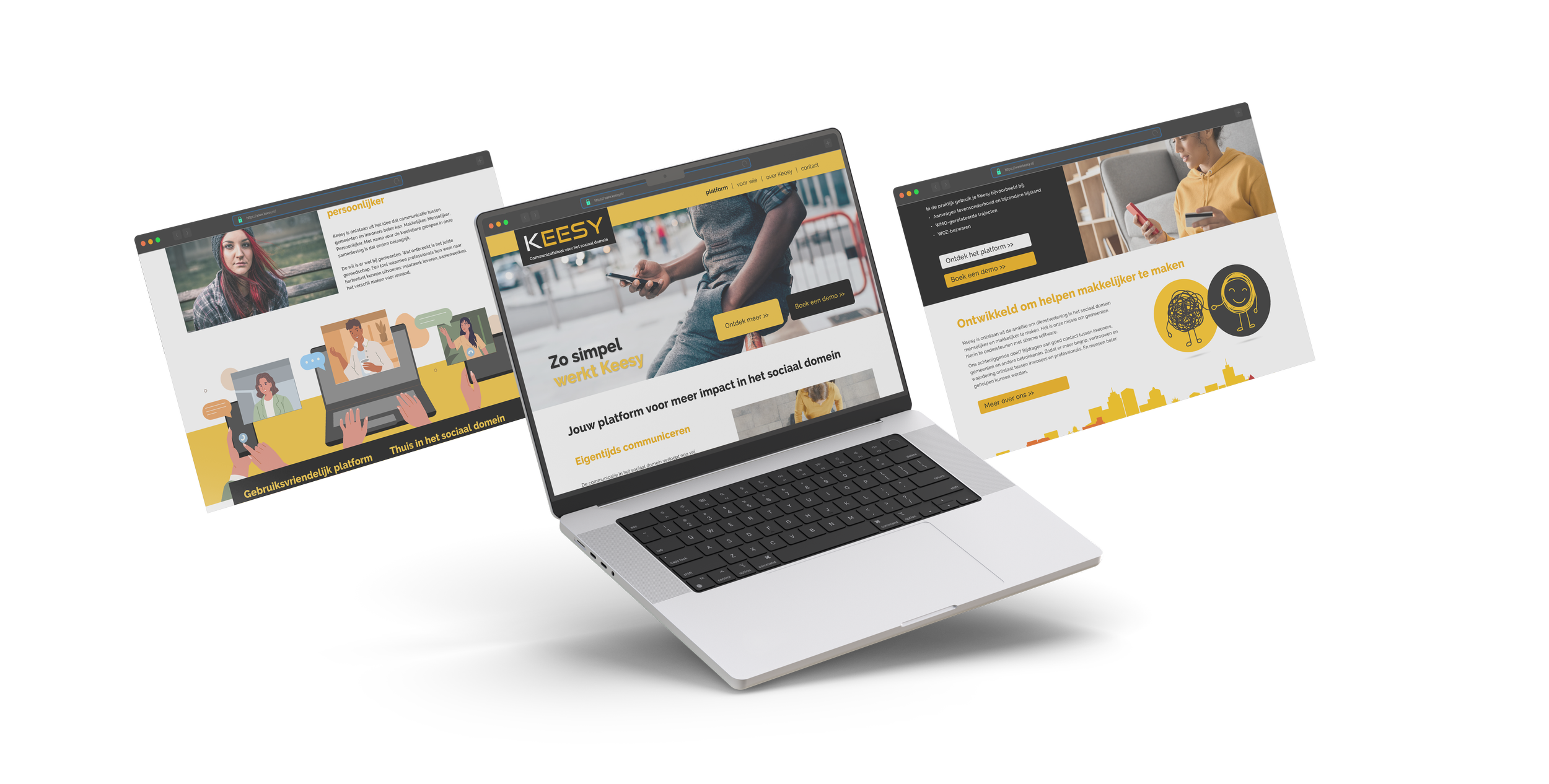
Web Page: A sleek, user-friendly hub showcasing Keesy’s benefits and features in a clear, engaging way.
App Design: Intuitive, clean, and easy to navigate – ensuring a smooth experience for all users.
Branding Materials: From letterheads to business cards and email footers, Keesy’s identity shines through in every touchpoint.
Animation: A fun, simple explainer showing how DigiD and Keesy work together for seamless access.
Deliverables
How it worked
The name Keesy was born from a blend of warmth and innovation, making it the perfect fit for a service that streamlines assistance while keeping people at the heart of it. "Kees" is a playful, phonetic nod that, when spoken in Dutch, sounds like "case," giving it a friendly, approachable vibe.
Meanwhile, "sy" hints at a smart, structured system, adding a tech-savvy edge that signals efficiency and reliability. Together, they create a name that feels both personal and modern, striking just the right balance between human connection and digital ease.
Keesy
Revolutionizing Municipal Assistance
Results Count
Paired with the tagline "Slimmer bijstand verlenen" ("Smarter assistance"), Keesy represents a fresh approach to support services – one that’s intuitive, accessible, and built for today’s world. It’s more than just a name; it’s a promise of a smoother, smarter way to navigate the system, ensuring help reaches those who need it without unnecessary hassle.
Keesy isn’t just about technology; it’s about making assistance feel effortless, bridging the gap between municipalities and residents with a name that’s as clever as it is caring.
More cases
-
Staad
quarterly magazine
-
Philips
vitalsigns animation
-
Alzheimers
full year campaign

-
Philips
operational intelligence