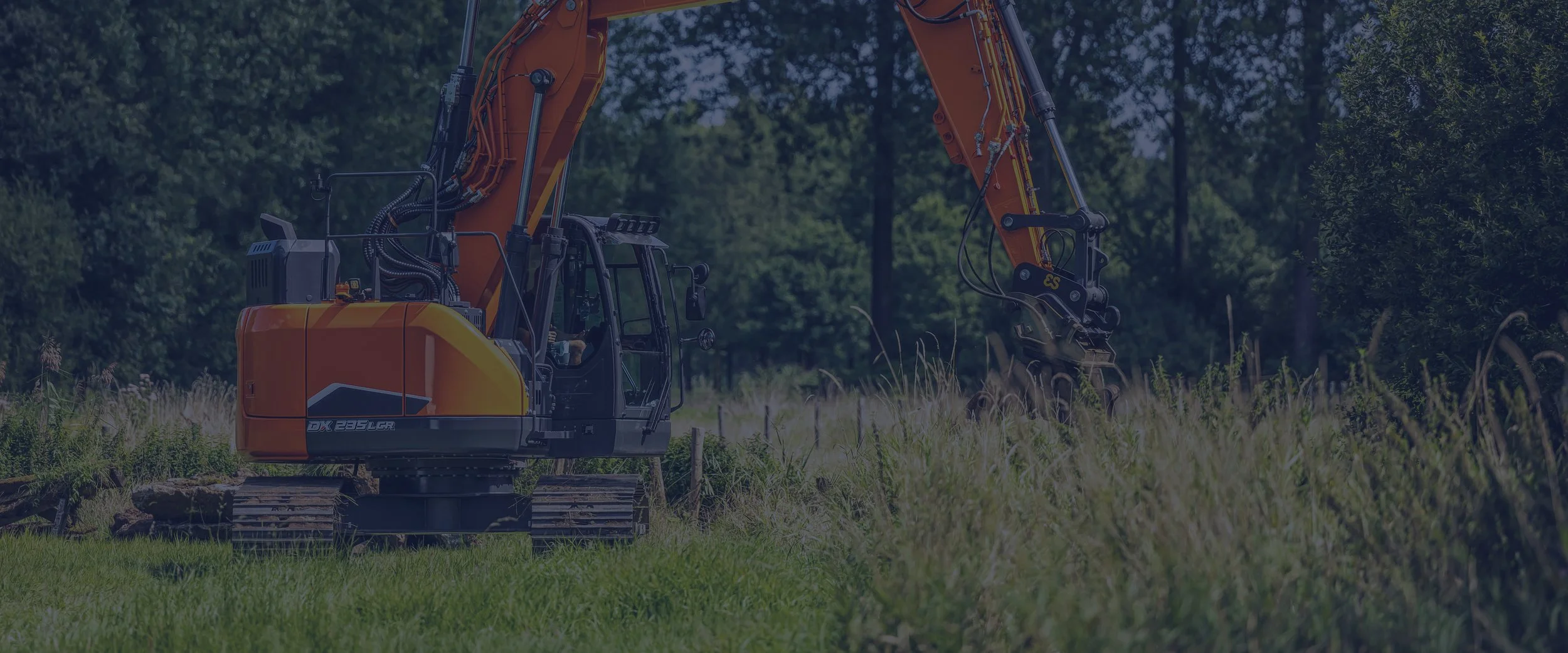
Seasonal stories, creatively told.
Staad Groep
Challenge
A magazine that existed, but didn’t live. Staad wanted more than pages: they wanted a publication that connects, surprises, and gets read. The stories were there, yet they didn’t come alive.
Solution
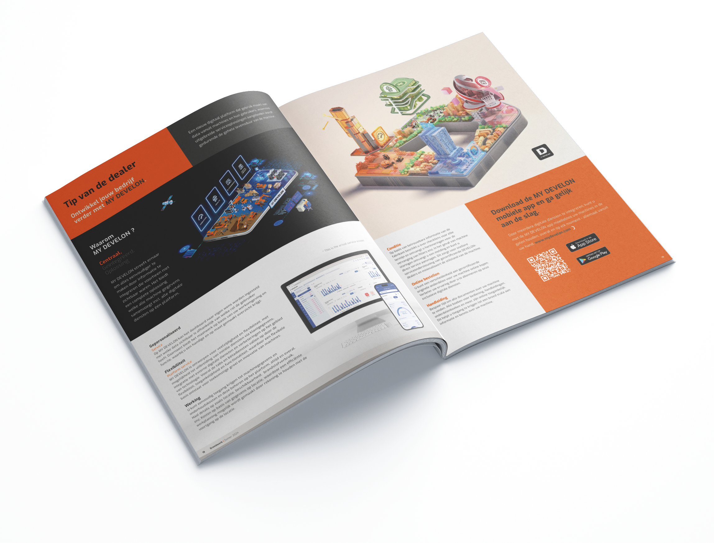
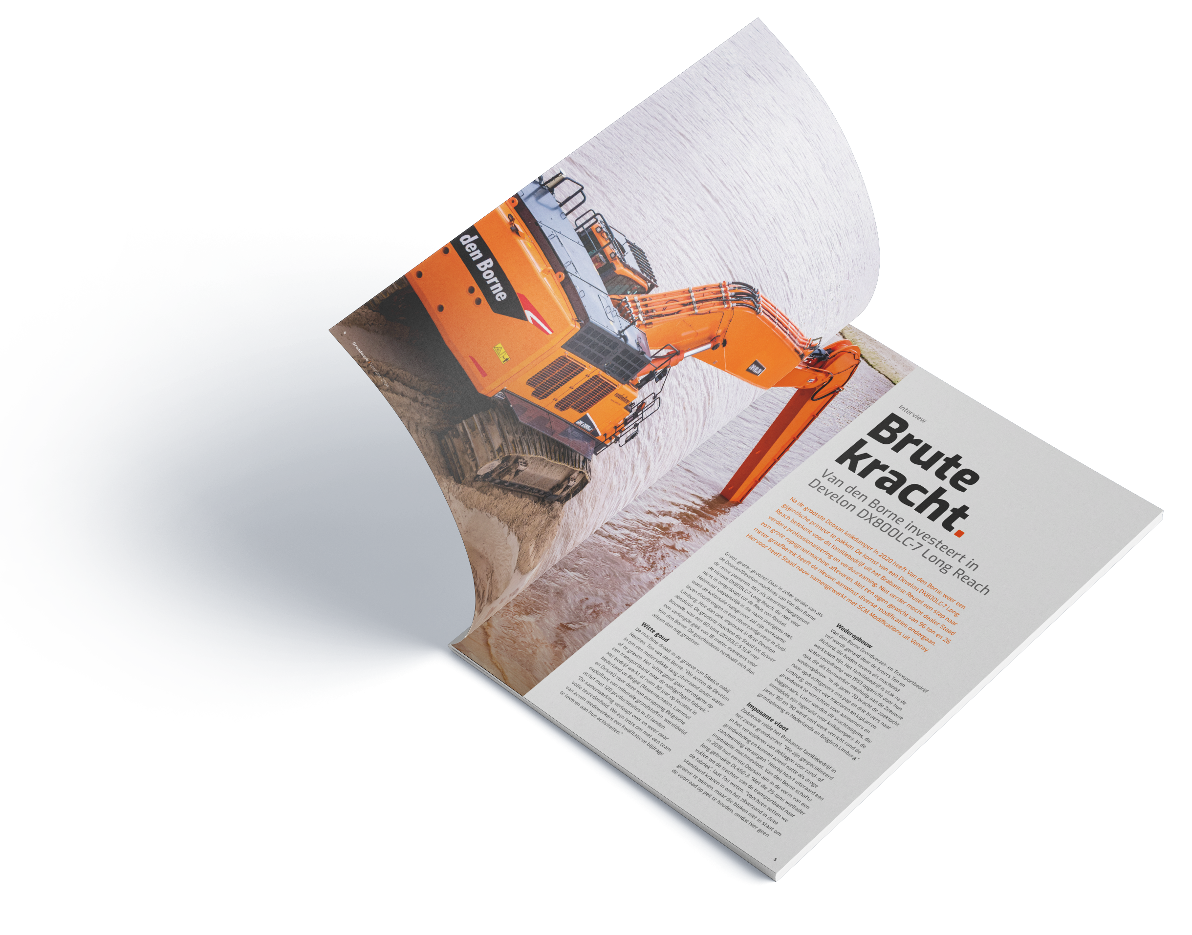
Four times a year, we create a 40-page magazine that breathes Staad’s identity—always recognizable, always with a fresh twist. Strong visuals, light extras, and a mix of stories turn it into a real brand experience. In both print and digital, the magazine reaches every corner of Staad’s world.
Results
The outcome: a magazine people don’t put aside. It fuels internal pride, strengthens partner relationships, and gives Staad a voice that people genuinely enjoy following. What once felt flat is now a true connector—boosting visibility, engagement, and unity across Staad.
Staad
Grondwerk
Case study
Staad already had a magazine. But it lacked spark. It needed structure, strategy, and standout design. In 2020, Staad asked us to reinvent it with a fresh, forward-thinking twist.
We said yes with both hands. Since then, we've been the creative engine behind every single edition of the Staad magazine. Four times a year, we shape the visual story that connects Staad with its customers, partners, and people.
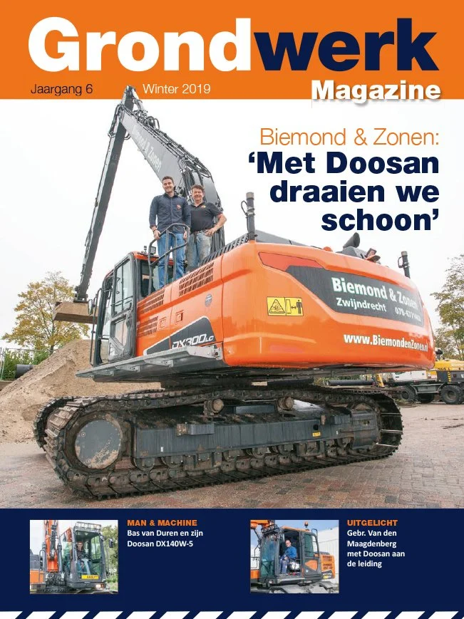
2019
Original magazine
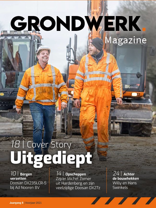
2021
Brand refresh
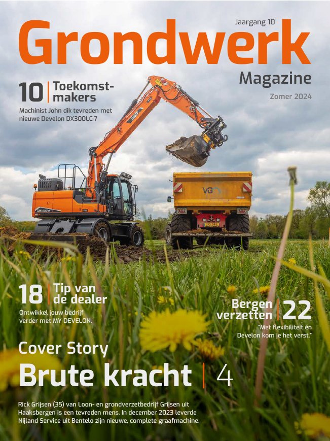
2024
Brand refresh update
Staad
Grondwerk
The strategy
Our approach? Strategic consistency with seasonal flair.
Every issue follows Staad’s brand guidelines, ensuring a strong and steady identity. But we never let it go stale. Each quarter, we subtly adapt the design to reflect the season—a touch of spring freshness, autumn warmth, or winter boldness.
It’s a rhythm that keeps readers engaged. Structured yet flexible. Recognizable but never repetitive. We create catchy headers to every section—guiding the reader and framing the flow.
We’re not just following the calendar. We’re creating a story that evolves with time—fresh each quarter, yet always unmistakably Staad.
Staad
Grondwerk
Deliverables
Complete layout and visual design for each 40-page magazine
Seasonal adaptations of the visual identity
Production and coordination of the printed magazine
Copy support when needed, ensuring clarity and consistency
We amplify every element on the page—shaping the story, setting the tone, and bringing each story to life. With bold layouts, custom graphics, and clever composition, we transform customer stories, columns, interviews, and even word searches into a compelling brand experience.
Both digital and print versions are delivered, ensuring the magazine reaches every corner of the Staad network.
Staad
Grondwerk
Results Count
The response? Immediate and enthusiastic.
Readers look forward to every new edition. The magazine has become a quarterly moment of pride—for Staad and their audience. It boosts internal connection, strengthens partner relationships, and expands brand visibility in a smart, stylish way.
We’ve heard it’s been read behind desks, on the job floor, and while sipping a quick coffee—some even say it gets more attention than their favourite Netflix show (and that’s saying something).
Big on identity. Strong on storytelling. Always on brand.
More cases
-
Alzheimers
full year campaign
-
Philips
ePatch photography
-
keesy.nl
brand identity

-
Philips
Made in 040